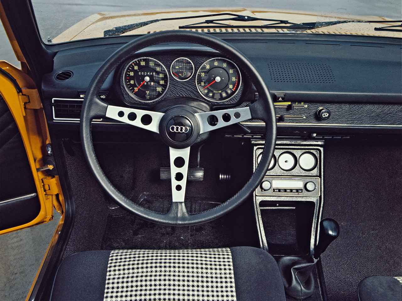
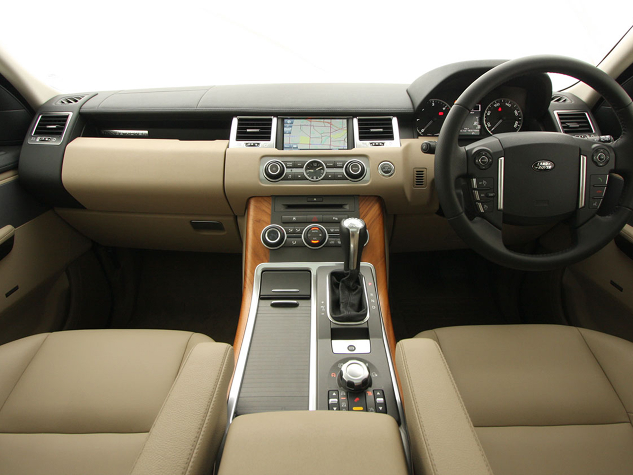
Cars generally are built to head one direction, forward. Interiors are congruent with this flow and rarely go against this y-axis. Movements of the controls also feel notchy and confident, dials feel precise and light. Forward, backward, in, and out can keep a UI harmonious with a car.


Radial Gauges
Radial motion is iconic in cars, and makes more efficient use of space to indicate progress.
Notching
Guiding movement along a linear path feels really simple. Hinting and snapping can be used to reinforce confidence in tasks and activity.
Turns & Crosses
Typically, cars are built to go forward, but there are times where we have to make turns and change it up.
Blinking Indicator
There are a lot of modal cases while driving, you're turning, you're braking, you have the hazards on. These are ephemeral tasks that can tie into performing tasks in UI.
Adapting some of the concepts into rough blocks in the car UI gives us a feel for the experience. Everything generally flows in the same direction in a facet. Colorized blinks are used to express focus, activity and modality. Facets are separated spatially and create a perpendicular break to confidently distinguish themselves from one another.
Facet Switching
When switching facets, we maintain a spatial model for each by dollying towards the virtual location of the icon.
Lens Switching
Lenses scale into a list and back out when selected.
Animate activity
Show activity in a facet through icon animation, also hint at facet choice through brand color.
Opening and Selecting
Incoming items slide left to right, maintaining the same flow as the sliding app block.
Backing out and Closing
Hitting back reverses the slide of items in view performing an "undo" like operation going right to left.
Inline Voice
Voice stays put, minimizing motion and avoiding obstruction. Nods confirm mic open and soliloquizes the mic by dimming the stage's lights. The scene transitions like a gearbox shift to complete the command.