
Elements
Thicken
We try to maintain volume of ink if condensed by animating thickness. Ink also dries by animating luminosity and allowing a shape to resolve gracefully.
Ramp
Forms
Icons
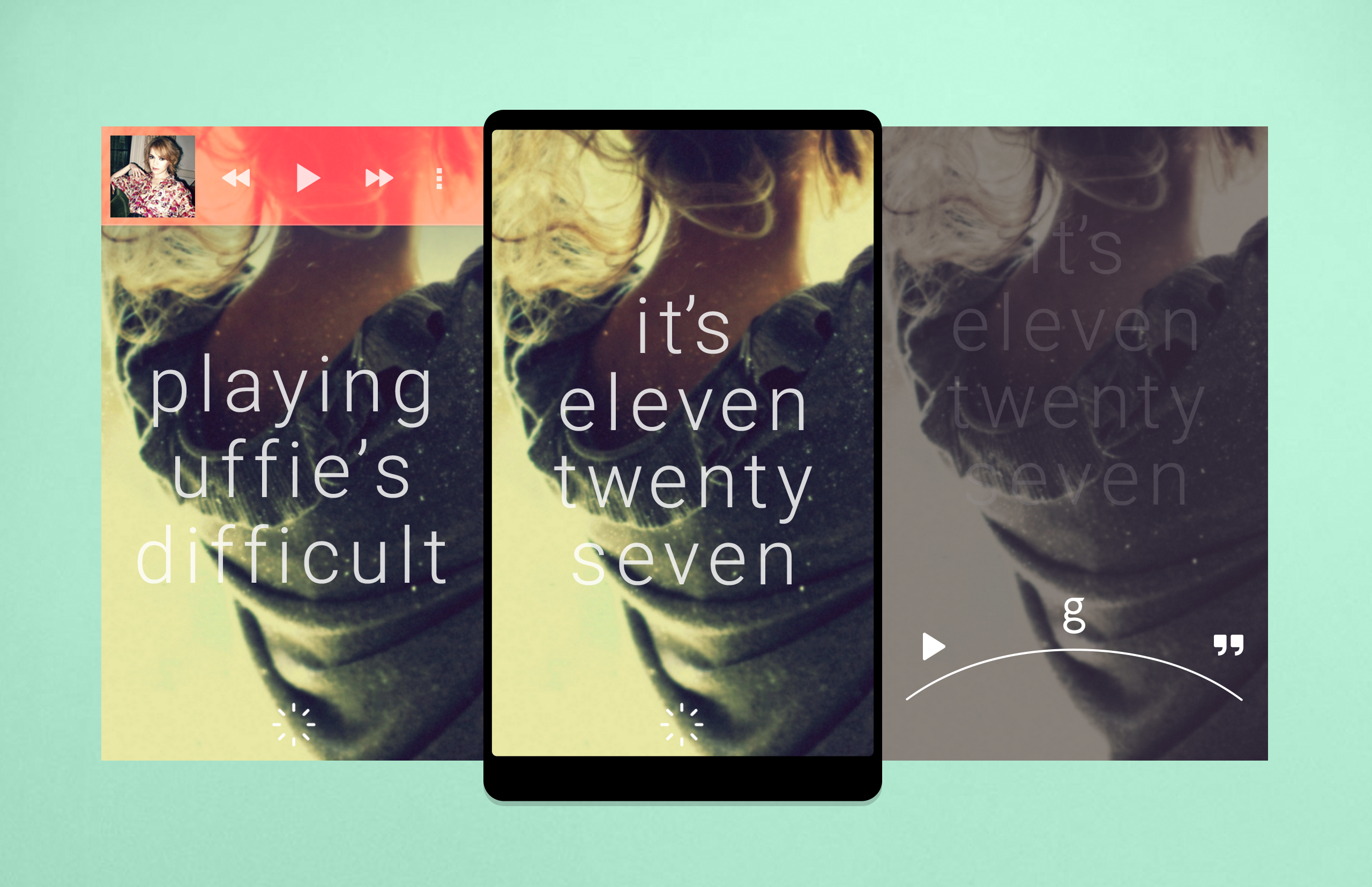
Loading
Spinning Loaders
Loading sucks and let's make it fun. Make it feel continuous and never ending, never losing momentum.
But also keep in mind we use these way too much. Opening an app, showing a splash screen, then showing a loader, then showing content flying in is way too much. We should keep loading transitions at a minimum and as light weight as possible and inline.
animate in content without ever seeing a spinner
if > 500ms pass
animate spinner and spin it for minimum 300ms, then animate in content
else show content with no animation
Pull to Refresh Bar
Determinate Progress
Indeterminate Progress
