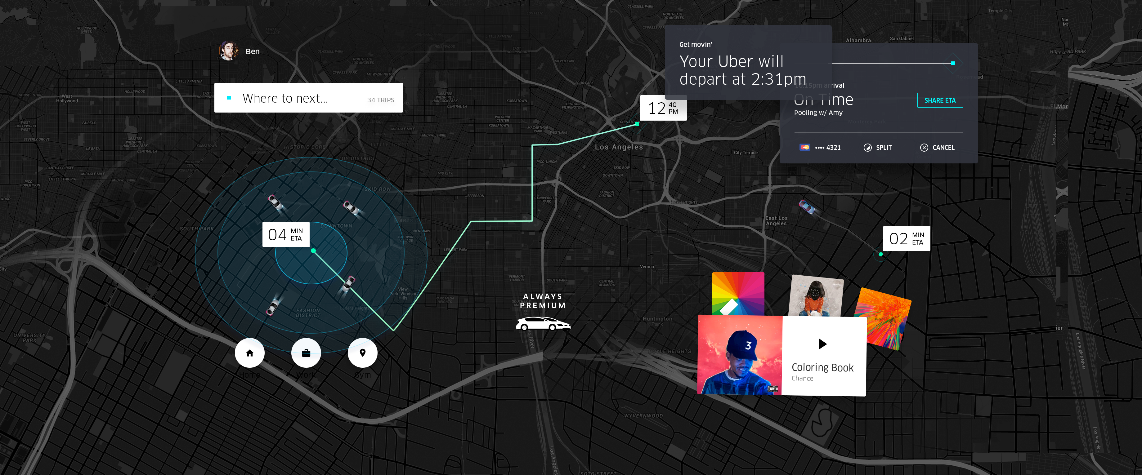
Uber's original premise was simple, "push a button, get a ride." You didn't need to set your destination, you didn't need to select a product, you just hit a button, or two, and you were off. As we added more features and our products became more complex, we continued to strive to keep the original simplicity and speed of a single button. But we realized that speed was much more than minimizing taps and streamlining a flow. People were selecting the wrong product when they had to catch a movie on time. Opportunities to save time by crossing the street to get picked up were completely missed. So we decided to design the new Uber experience with a simple twist and started at the end.

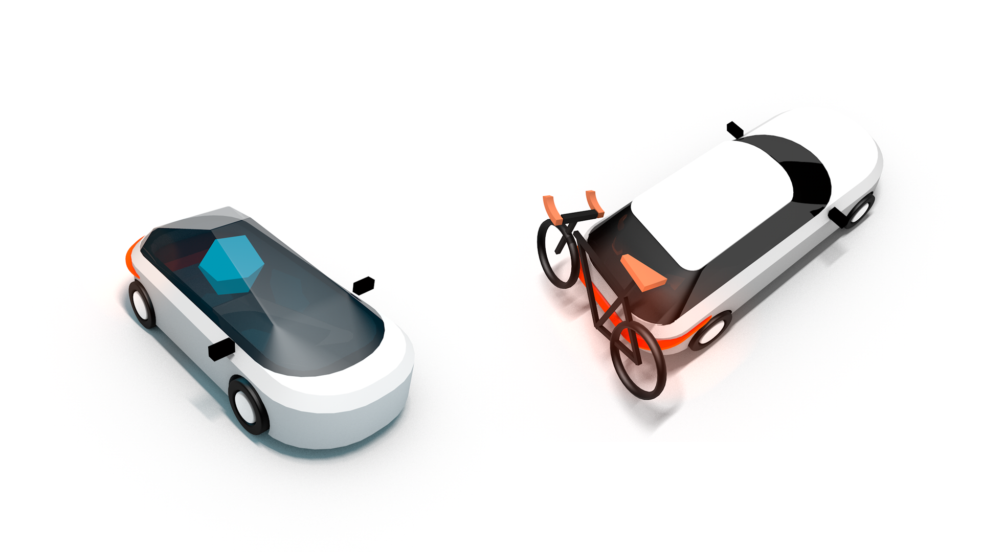
Solid objects on a two-dimensional surface so as to give the right impression of their height, width, depth, and position in relation to each other when viewed from a particular point
When a rider wants more information, we give them a fresh perspective, a different view of the world.
We use depth to drive focus, we elevate objects so you have an understanding of how they’re built and where they belong.

oh my god the new uber app looks stunning pic.twitter.com/Fu5p92PYxe
— juan buis (@juanbuis) November 2, 2016
Uber really knocked it out of the park with this re-design. Facebook Paper level UI improvements, but in a practical & shippable form
— Bobby Goodlatte (@rsg) November 3, 2016
The new Uber app is so fucking sexy
— Jeff (@JeffTutorials) November 2, 2016
I don't even want to buy a car now lmfao
The uber app just went futuristic
— Dom (@_BeerBellyBoys) February 3, 2016
New @Uber app = Tron in real life. pic.twitter.com/PRyVTwZqQx
— Jonathon Triest (@jtriest) November 3, 2016
The new uber app is lit 🚗🔥
— Brandon Marsan (@blessed_fitness) November 6, 2016
So Uber might be evil but the new app is really dope
— Christina Warren (@film_girl) November 2, 2016
Great update. So much faster https://t.co/eIKzlrQaj0
— jack (@jack) November 2, 2016
I just keep launching and terminating a new @Uber app to see how ultra-fast it's up and ready to go. Neat. #ios
— Michał Śmiałko (@msmialko) November 2, 2016